Hi all! Hope you had a fabulous weekend. I have a case of empty next syndrome this week….my twins are on their 8th grade field trip to Chicago until Thursday evening! This is the first time they have been away from home without us….crazy as that sounds. They were very excited and hubs and I are very excited for them! It will be a great adventure—but I am sure by Thursday we will be really missing each other. Also, Derby week kicks off here in the bluegrass….go baby go!
Today on #clevermoving Monday, I am going to share with you some of our decisions for the Kitchen in the new house. Cabinets take awhile to build…so we had to work on this earlier than I was planning. It helps that I am very decisive, I know what I like and what I dislike, my hubs has no opinion…(like at all….he hasn’t seen any of the finishes that I have picked….) I realize that would completely freak some of you out….but this is how we are set up…and it works for us. We have similar taste and he trust what I choose. We laugh about it…because he will walk in our new home on moving day and be completely surprised.
Our builder works with a local company called Century (if you go there ask for Janet….she is a doll and so easy to work with!) They sell custom cabinets along with semi custom (from a company called Wellborn). We went with a semi custom cabinet. It is a solid maple cabinet with lots of fabulous features that I won’t bore you with now.
Here are some of the items that we have already selected…and a few things for you to consider when you are starting from scratch….
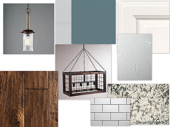
Our style is very clean, coastal and comfortable. We tend to like blues and grays over tan and browns….but in almost every room of our home now we have mixed the two palettes. I love the combination of gray and brown. Classic. The board above is basically the design for our new kitchen. Bold blue (this is not set in stone yet….still considering a few other colors) on the walls, palest of gray (Light French Gray by Behr) on the ceiling just to allow all the white wood work pop….white cabinets, Bianco Antico granite, farmhouse style lighting, a bit more modern subway tile that measure 3X8 with gray grout, oil rubbed bronze fixtures and hardware pulls, rustic grade random width hickory floor that will be stained Minwax Jacobean…all of it is so us….and very “user” friendly. Nothing is too perfect that it cannot be used and loved…a bunch. You might think it looks a lot like my current kitchen…and you would be right. Right now the color on my walls in my kitchen is not nearly this bold though. The new house kitchen has super tall ceiling and tons of light along with trim work galore, so it can definitely handle this Phillipsburg Blue color on the wall (although I am not 100% sold on it quite yet.)
If you are starting a remodel or a new build….here are a few things to think on….
Know your style. Do you like traditional? Modern? Simple? Fancy? Ornate? If you can narrow down your taste a bit by showing the designer pictures and styles that you are drawn to…that will help jumpstart the design.
Try to use finishes that are timeless and add accents with minor details. I chose white cabinets. By adding seeded glass to a few of the cabinets…I can change the color on the inside of the cabinet to add a little pop of color.
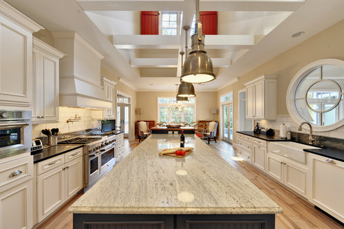
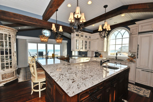
Choosing surfaces that will be easy to maintain and appeal to a variety of color palette changes is always smart. For the granite, we chose Bianco Antico which is similar to the slab shown below….it has creams, grays and a bit of tan. It will look great with any color that may be on the walls.
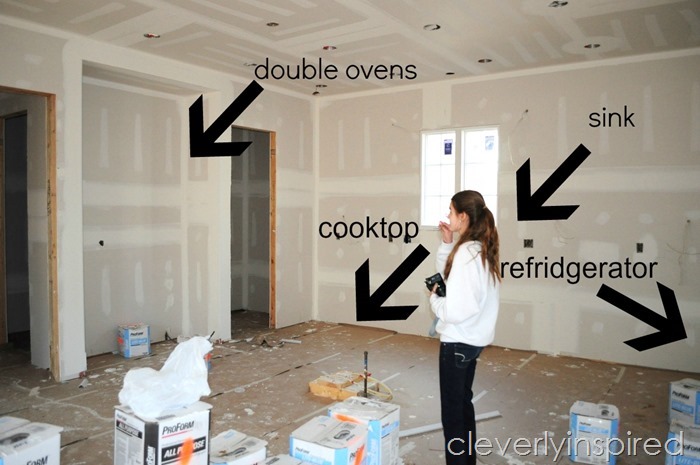
Consider your work flow. The triangle of the kitchen typically is sink, cooktop, fridge. The oven can be a little more “out of the way” since you usually just go and place something in there and let it go. We will have one kitchen sink that will be a large stainless steel single bowl that is located under the window. Our gas cooktop will be directly opposite the sink in the island. The fridge is on the wall opposite the pantry.
Think about work centers: like if you bake a lot…a space for your mixer and drawers handy for utensils….A dedicated coffee bar space….A lunch-making area with handy drawers for ziplocs and to-go containers….If you can brainstorm a bit on how you use your kitchen now…and what works and what doesn’t—you can make adjustments for those things in a new space.
Those are just a few of the things that we have considered….what would you add to the list?

I love your mood board for your kitchen! It’s going to be beautiful! Excited for you!
Love, love, love! Can’t wait to see how it all comes together. And those floors? Be still my heart!