Well… happy Monday you all! Today is book day for my bubba. I can’t believe that summer is closing in on us! It really does go way too fast. It’s funny because when the kids were preschoolers I really couldn’t wait for the end of summer but now just two years away from college… the summers are really precious. I survived Universal, Wet & Wild and Epcot this past week. My bubs and I had so much fun! I was holding on to him for dear life through most of the rides which he found completely hilarious. We had a lot of great conversation and a lot of great laughs….so happy we took this trip:)
I wanted to continue the tour today of the homearama house. I mentioned on Facebook this past week that unfortunately our house was not the big Grand Prize winner this year…but we did happen to win the best lighting award. That really made me happy because I did spend several hours and days questioning the lighting choices and making sure that each light fit the room perfectly. I’m so happy that the judges noticed. Out of 25 houses it sure was difficult to pull out an award and just winning one for lighting really made me happy.
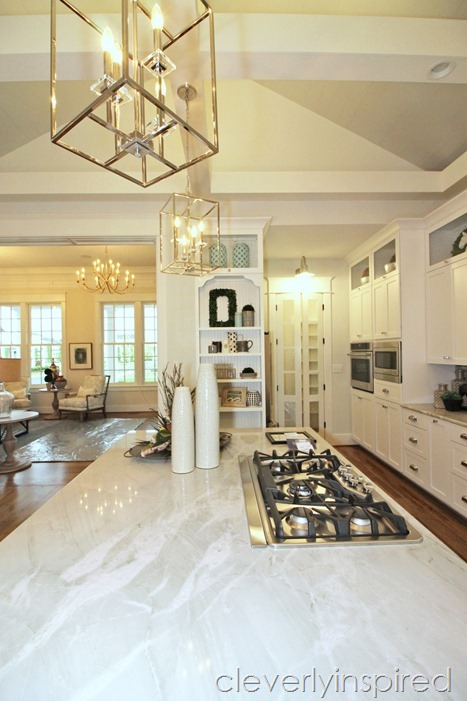
I’ll be sharing more about the specific lights for each room in coming days. Today I wanted to share with you the kitchen which was really the main heartbeat of this house as it is in many floor plans. What we found is that folks really loved to the space because it was gracious on size. On our preview party night we realized that there were probably around 30 to 40 people just in this space and it really never felt crowded.
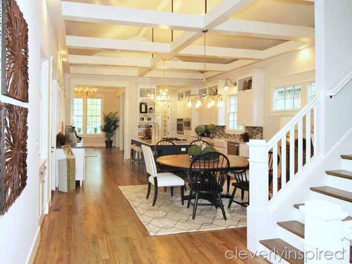
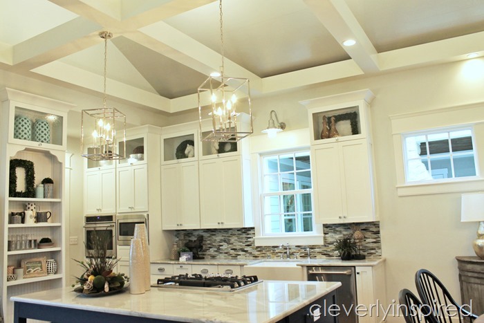
It’s a comfortable livable kitchen that has a lot of style. One of my readers described it as Ralph Lauren’s kitchen. That was really the highest compliment I think I’ve ever received! My thought with this space was to make it elegant but yet very casual…. make it comfortable for men and women. I wanted it to have some “reclaimed” qualities and yet have very clean and modern edges at the same time. I will show you some of the main features that really stood out to people who came through this house. If you have any specific questions or details that I haven’t touched upon please be sure to shout out at me on social media and I will be sure to answer any questions or share more pictures. You enter this space from the family room which I shared with you last week. You immediately are taken in by the ceiling of this space. We called it a floating coffered ceiling. The main ceiling towers to a cathedral and we “”covered that ceiling with 1 by 6 Pine and painted it Stonington Gray. 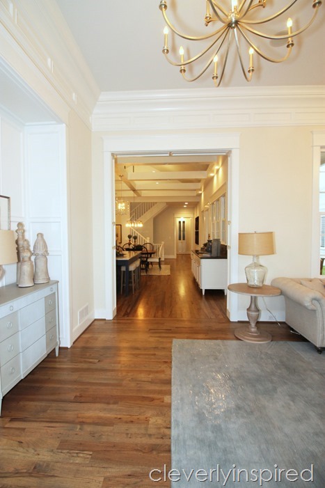
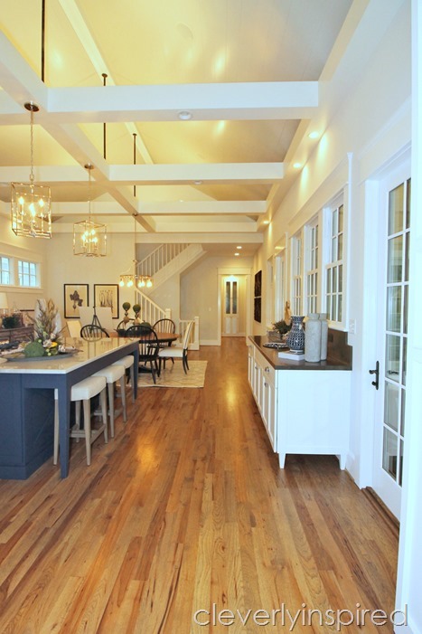
We then had these massive beams that we painted the trim color which is pure white and they came off spectacularly against the gray walls and ceiling. Little details like adding up lighting to this coffered ceiling system was really a show stopper. This really does give the feeling of a very modern space initially. Because this house does not have a formal dining room we wanted the kitchen to definitely play both roles no matter the function. As you walk in the space you notice to your right this long base cabinet.
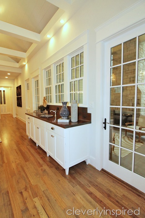
My feeling for this cabinet was to have some reclaimed qualities even though it’s brand new. We decided to use the same base cabinet as the rest of the kitchen but put a solid cedar countertop on it and stain it dark. A handmade porcelain sink from Mexico that was hand painted was dropped in the center. 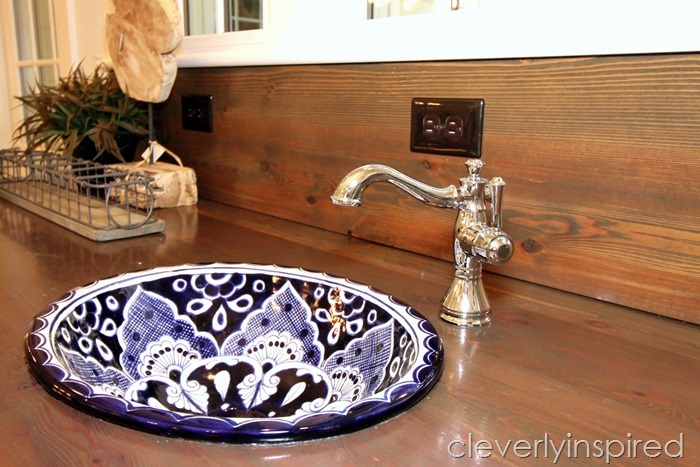
The juxtaposition of this sink and base cabinet… that is made to look like you repurposed grandmother’s favorite dresser into a sink… against the very modern edges of the ceiling is exactly why this room works for everybody. I think probably 85% of the people that walk through touched this sink….”how cool is that.” Touches like this make this space comfortable and livable kitchen.
The cabinets are simple and understated…pure white. The island is massive and the color on it is Naval by Sherwin Williams. For the counters, I chose quartz (the name is called Nuage). I would say about 80% of the folks who came through commented on how much they loved the counters. They are gorgeous!!! 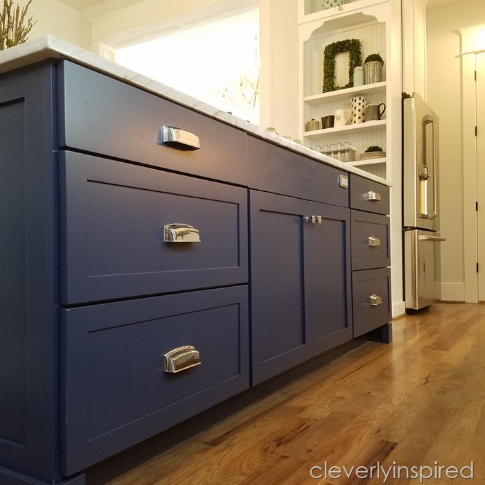
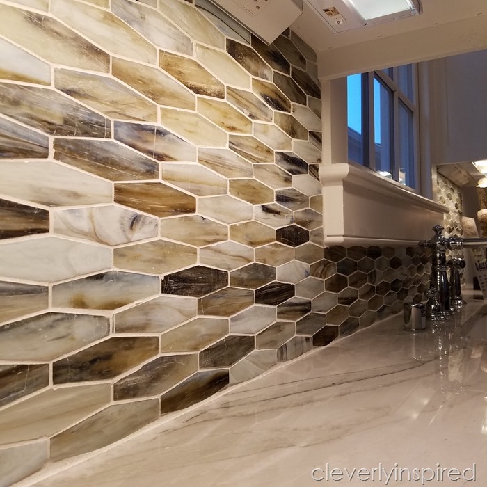
Another feature that people seemed to love—this backsplash. It is a mix of marble and stone…in this interesting long hex pattern. Find locally at Louisville tile in Westport village.
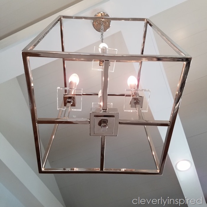
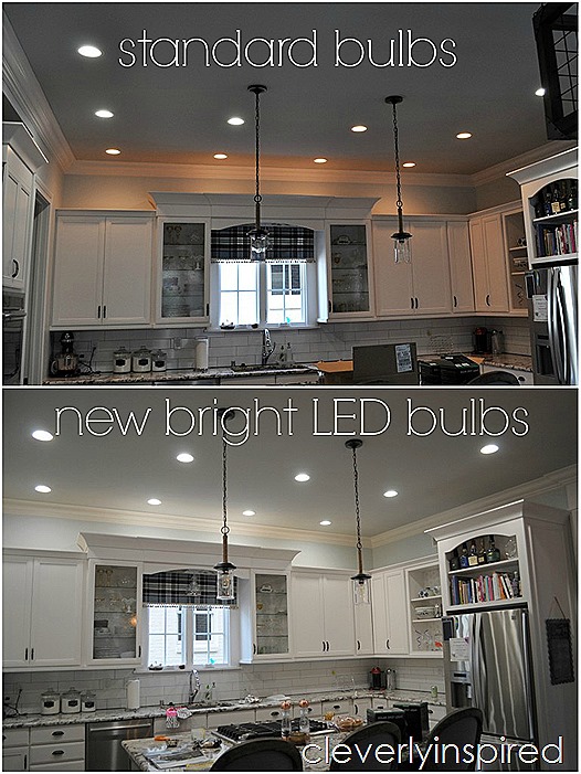
All of our lighting came from Bretcher’s lighting. The mix of the modern pendants on the island and the farmhouse above the pantry….LOVE!!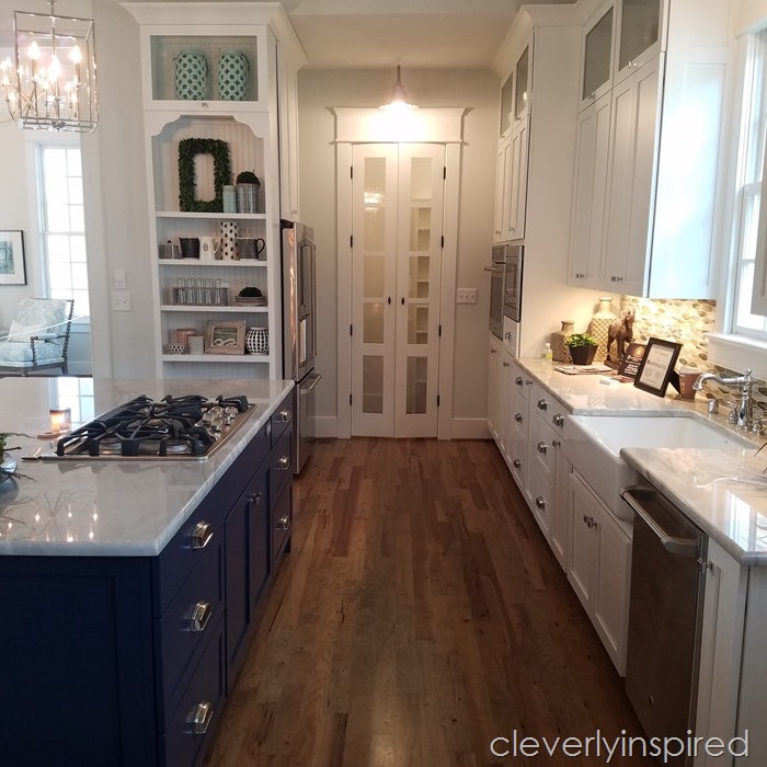
A few other stats about this space:
- Floors are solid hickory stained on site (mix of charcoal and jacobean stain)
- Cabinets are custom made by Countryside cabinets.
- Color on the wall is Nebulous White Sherwin Williams, Stonington Gray (Ben Moore) on ceiling, Pure White trim
- Accessories can be found at Madhouse New Albany
- Furniture from Ethan Allen
- Builder Simpson Builders
Let me know if I forgot something:)
Have a great Monday friends!!



I love the pendant lights! Would you be willing to share the brand/style of them?
Just gorgeous!!! Every detail is stunning ❤️