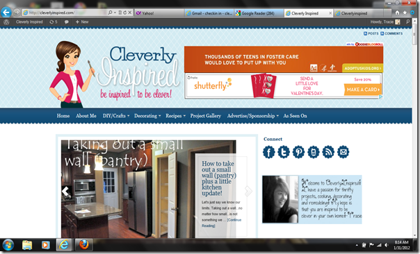
Hi all! So excited to share with you my new blog design. I need to start off by saying I completely love Green Tangerine designs. Allison is simply amazing at what she does. I told her a few ideas I had… and then it was like she jumped right in my head and knew exactly what I was looking for! If you are thinking about switching over from blogger to wordpress I would HIGHLY recommend Allison. She is efficient, affordable and so talented it is crazy.
Some of you were asking why I am switching…a few reasons really. I wanted to own the content that I write on my blog. Blogger is a great platform…but if Google wants to pull the plug on you, they can at any moment. I wanted to have the assurance that the content remains mine. I also wanted more flexibility in the design. Allison really brought this idea to life for me. I wanted a rotating picture display on the top to show the last 7 days of post…so that the photography can be the main attraction. I felt like I needed more flexibility in how I present my material…and wordpress enables me to do that. My goal was to make the material I present easy, fun, quick to find and interesting. Also, you will be able to comment so much easy here. And I can comment back! Super easy!! I hope that you like it as much as I do. Let me show you a few new features…
When you open the home screen you are greeted by my new little “self” (she looks much more put together then I do! ) I thought the paint brush in her hand was appropriate. The tabs at the top of the page are pretty much the same as the old site. One thing we added was some drop down list to the category pages. My goal is to help you find something quick and easy, and I think this will help. Also, for the project gallery page…it will be just images…click on the image you want to learn more about. You know how I love my pictures…and I really wanted to showcase them here. I kind of like the idea there are no titles or words…just blocks of fun pictures. It is more of a “browsing” gallery…when you have time to just sit and peruse. I am still updating pictures from some of the older post.
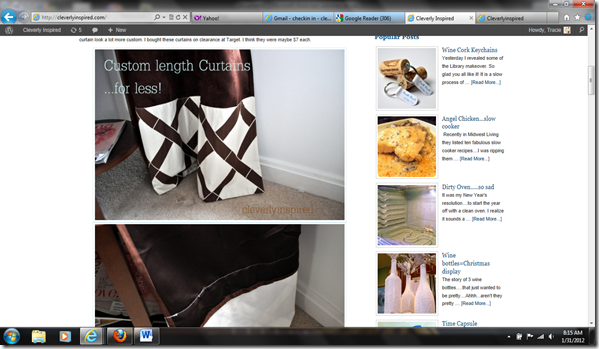
The other really sweet feature is the rotating slide picture show. This will rotating pictures from the last 7 post. Incase you want to click on something you may have missed…it will all be right there. Under that will be the current days post in it’s entirety. Then under that again will be thumbnails of this months post. Easy peasy![]()
To the right side bar I have added the most popular post for the past few months. Easy !
Also, let me take a moment to give you a few ways to keep up with me here at Cleverly Inspired. You will see all my social buttons on the top right. I am on Facebook, twitter, pinterest,and there is a mobile phone app. I am sure you are aware if you read other blogs that Google is doing away with Friends Connect…so that “follower” list is no longer an option on here. If you still want to read in a “reader” platform…just subscribe (where the little rainbow looking sign is ). One the of the easiest ways you can read the blog is to have it directly delivered to your email box. Sign up right below my welcome picture and that’s it! I am hoping to keep the 3,500 of you that are already signed up. But if you notice you aren’t’ receiving it anymore…just sign back up please. Click on that and enter your email and that is it!
Again…thank you for reading and thank you for your kind words. I love this little blog and I am having so much fun with it! And thanks for being so patient!!!
Ps….I will make this font large…sorry this one it a bit hard to read ;)


Great new design. Very user friendly.
Jackie
Oh you are such a dear….I feel like I have given birth this week!!! But so worth it..I am loving it too! Thanks for being such a loyal reader!
Your font isn’t hard to read at this size. I like it when it is smaller rather than bigger because I get headaches when it is too big. I am probably alone in this, but just thought I’d let you know in case I am not the only one!
I love it though! Very cute – easy to navigate. So much fun to change things up!
Thanks Sarah!! And thanks for the feedback! So happy you find it easy to navigate :) And thank you for reading!!
Very nice. Change is always good!
:) Thanks!
First off I love the new site and subscribe & read avidly :)
I am also concerned about blogger, in the current climate of Google + absorbing everything (and the drastic news that Picnik will shortly be no more) that Google will attempt to reformat blogger, as today, without warning blogger changed my domain from whatkatyatenext.blogspot.com to whatkatyatenext.blogspot.in which has thrown all links with partner sites :(
How did you go about creating a new non static website? Did you use Green Tangerine designs for everything or did you do your own basic formatting?
Any thoughts on transferring from blogger to a more independent would be most appreciated
Thanks :)