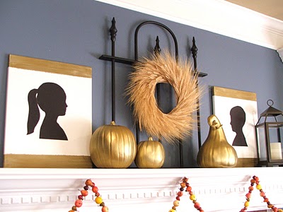
Good news….my knee is on the mend….and Stella has spent the last few days apologizing…in her own special way:) Sometimes I miss the mark….and this moodboard was one of those times. What I had envisioned for this client was not exactly to her liking. She loved some of what I put together….but she was going for a different vibe. That is one of the pitfalls in “e-design”, I cannot have a personal interview of the space…and walk through other rooms in the house to get a better idea of the clients taste. Marybeth decides to go with a beige on the wall…and she is going to keep me posted…so I am looking forward to see it come together. However, I wanted to share with you what I “saw” when assessing her space… a little French inspiration today….
I was recently contacted by MaryBeth. She was trying with all her might to recreate an inspiration picture she had cut out of a magazine awhile back. She wanted it to come alive in her own kitchen. Marybeth had her cabinets painted a creamy white and new granite countertops are being installed. She had chosen a light colored granite / marble countertop and her backsplash was not going to change. She had painted her walls a yellow color…just like the inspiration picture however she and her family were sort of unsettled with it. Her words were, “I feel like I’ve picked everything in my inspiration picture but yet my kitchen does not reflect the same feeling.”

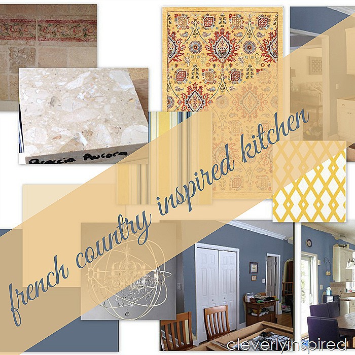
I set out to do a design plan for her that could pull everything together and help her vision come alive. Her taste were (under my assumptions) traditional French country…. cool tones of blues against warm yellows and whites. She loves white and blue pottery and after looking at her inspiration picture I came up with a plan to see her vision through.

One major difference between her kitchen and her inspiration kitchen was the flooring. In her inspiration picture the floor was much darker. In her kitchen the flooring is more honey than brown. It was fighting with the yellow on the wall. Here are my suggestions that I sent her to create the feel of this French Country Kitchen.

Instead of doing yellow on the wall I suggested doing a blue. The idea in using a blue on the wall is that it wouldn’t fight the floor and it would complement the existing backsplash and the countertop that she had chosen.

(in the pics below I applied the wall color using Sherwin Williams color visualizer…)

Touches of yellow would come in the form of the fabrics and the area rug. I suggested that she update the lights above the island with these easy fixtures that basically use the recessed light housing…just switch out the bulb and hang…easy! No electrician required. I like the idea of warming up the table and chairs with slipcovered chair backs. Also pulling in some yellow and blue on the window treatment. As for her feature wall I thought it would be a great idea to do a nice chunky chalkboard frame maybe in a distressed white finish…with possibly wallpaper behind framed out.
")
Here are my suggestions that I sent to MaryBeth:
")
We want to really play up the cabinetry and the counter tops and my thought is to put a true or color on the wall. The one I show here is Sherman Williams Distance. I think that your taste are a bit more traditional. My feeling is that you do enjoy a little bit of French country and this kitchen will lend itself nicely to that color palette. I think that grounding the room with a statement rug like this from rugs USA will really bring your tile, your family room and your kitchen to all work cohesively. The rug has touches of red, blue and yellow and will work to ground those spaces together. You can leave your family room the color that it is. It will work with this blue very nicely. I would also suggest to possibly painting the ceiling this Buff color by Sherman Williams (or ½ strength of the Hawthorne Yellow from the family room. It will make your trim work really pop off the ceiling and be a nice feature. I think that this plan is similar to your inspiration picture. As I said in my previous email your floors have a lot of honey color which will fight most yellows that you put directly vertical to them. That is why I really like the blue to be in the entire kitchen and your accents to be in yellows and whites and reds. The blue that I like for the walls is called Distance by Sherman Williams. I would just try it on a large poster board first to see how you like it with the cabinetry and counters. A few accents that will really put this room together are as follows,
1. These pendant recessed light adapters sold by home decorators would be perfect above your island. They are really easy to use you just unscrew the recessed light and trim kit and replace with the pendant light. A very low cost way to add island lighting.
2. I think making the kitchen table light a little bit more special would be a great idea. This chandelier sold by overstock.com is just a little touch of jewelry above the kitchen table it has soft colors and a little bit of sparkle at a very good price.
3. Adding some fabric will also tie this room together. I would suggest this fret work pattern in yellow for valence above your door and your window. I also like the idea of possibly slip covering the leather chairs with this striped fabric. Fabric is an inexpensive way to really finish off the room and also whenever you tire of it it’s very inexpensive to change out.
4. As for the wallpaper I’m not a real huge fan of just doing one wall. However, you could use some on the feature wall. I like the Cole and son wallpaper in the Albemarle Chatterton pattern. Pale yellow would look beautiful against the blue walls. Instead of doing the entire wall you could make a large picture box to go in between those two doors on the feature wall. Trim it out in picture frame trim and paint white. Inside you could hang a few prints like the ones I have suggested on art.com.
5. You could also consider doing a large chalkboard with magnetic paint. Frame it out in an off white trim. You could also do some floating shelves for vases and plates to display. A few plate racks that hang on the wall with the white and blue porcelain plates would also be a nice piece of art to introduce.
I hope this is looking more like your inspiration picture! If this is not the direction that you were looking to take please be sure to contact me and we can talk it out. I just think that with the light colored floor and the light colored countertop you really do need to inject some color like this blue to really show off those finishes.
(Rug USA http://www.rugsusa.com/rugsusa/rugs/rugs-usa-cy19/gold/200ATCY19C-508.html
Island lighting http://www.homedecorators.com/p/charlotte-small-instant-chandelier-light-conversion-kit/250/
Chair fabric: https://www.fabric.com/buy/0321201/duralee-home-claires-stripe-ii-twill-blue-yellow
Do you have a space that you need some help pulling together? See the design services tab at the top of the blog….I’d love to help you!
Have a great weekend friends!
xo