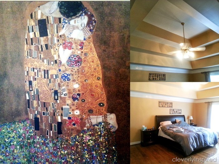
A few months back I was contacted by a reader who was having some trouble “pulling it together” in her master bedroom. She asked if I could come and take a look sometime to give her some ideas to freshen up the space. This room has a ton going for it….it just needs a bit of direction….
It is a large room with great furniture…fabulous window and a ceiling that is a show stopper. The homeowners hate the gold and red “theme” that is throughout the house and they wanted something more clean and fresh. An anniversary gift from him to her was hanging on the wall and it was my inspiration for the room. Here are some suggestions I had to make this room more comfortable for them…
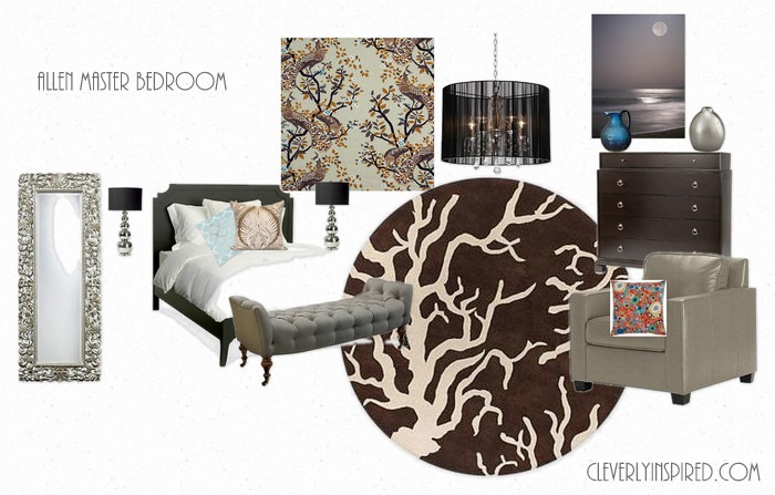
Working with existing furniture….I came up with a pleasing palette that includes browns and creams with pops of blue/gray. The large area rug will ground the space and make it feel a bit more modern. This ceiling is begging for attention…so I suggested hanging a fabulous fixture and painting the horizontal parts to the ceiling a richer brown/beige that will play nicely with the cooler gray/blue on the walls. I suggested black and white prints for artwork…some sparkly lamps on the bedside tables and a large floor mirror. The fabric I picked for the window isn’t cheap….but you don’t need too much for a couple panels on either side. It draws off the anniversary wall art nicely too.
I love pairing the gray leather with all the brown tones. It is feminine and masculine…perfect for a master bedroom!
The colors I asked her to try out are
Quiet Rain by Glidden
White Lagoon by Glidden
Smooth Stone for Ceiling Accent horizontal space
You can see my complete buying list here on Olioboard…..
I would love to put together a space for you….see the design services tab at the top of the blog home page:)
