Hi all! Happy Monday….hope you enjoyed some lovely fall weather! I have been working on a little mini update to our master bath…can’t wait to show you more soon….
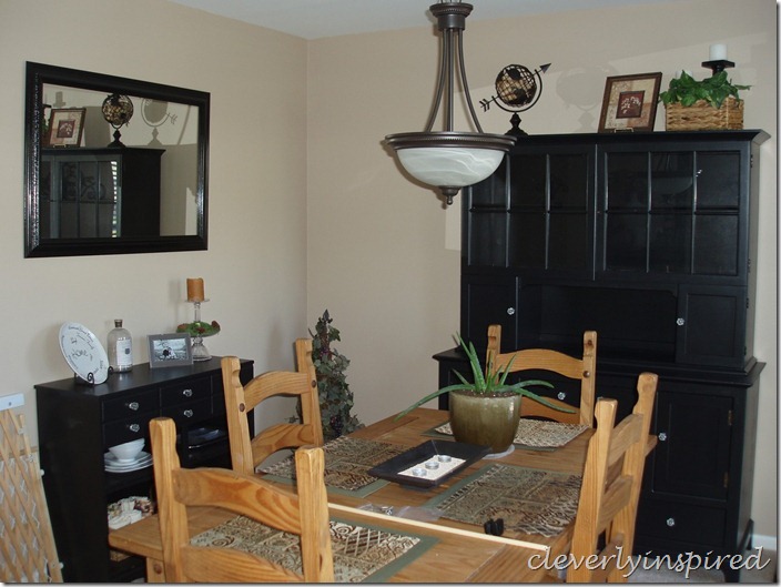
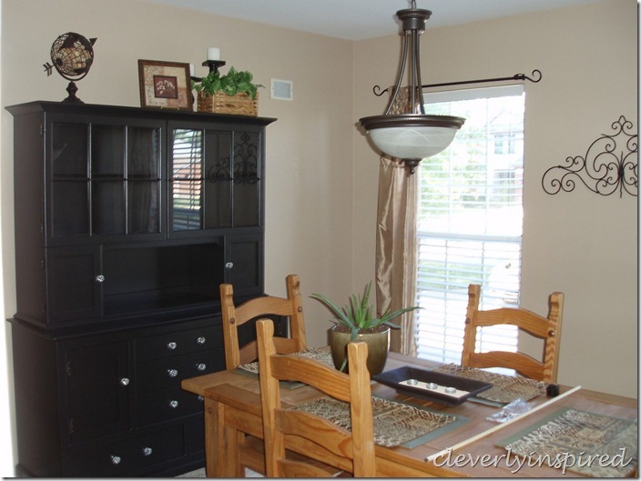
I received a request from a sweet reader named Kelly. She was needing a bit of direction for her dining room. She recently did an amazing job on repainting this gorgeous china hutch and adding some lovely vintage knobs to it…but then she got a little stuck. What to do now?? She emailed me and purchased a “design plan” and I went to work.
Kelly answered a few questions to give me an idea of the colors she is drawn to….she likes warm colors so that is where I began.
The room is about 12 by 12…which makes it a really nice intimate space to dine in….and this is why I leaned towards these warm and cozy colors.
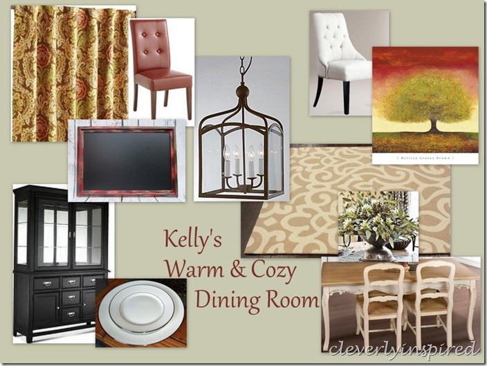
Here are some of my suggestions….
Color for the walls is Soft Fern by Benjamin Moore. It is a lovely sage green and will play nice with the pop of black in the china hutch.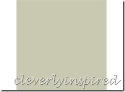
For the existing table….I would suggest painting it a distressed ivory (you could even leave the top natural wood and just paint the legs and apron….like the picture above depicts) As for the chairs….I would keep two that you have and replace the head chairs with this rust upholstered chair from World Market. It is a nice pop of color…plus it’s comfy :)
The inspiration for the colors in here are dictated by these fabulous panels from Pier One. I love the pattern and the colors are classic. I would hang the panels as high as you can to have them hit the floor. I would do one long curtain rod along the entire wall and do two panels on each window. The texture is needed in here to warm up the space.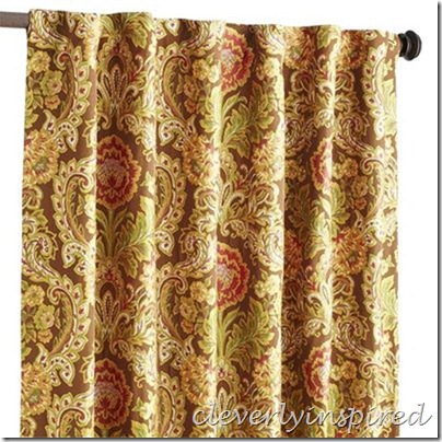
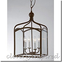
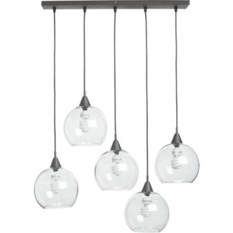
A centerpiece for this room is this fabulous light fixture. I love it because it plays updated traditional and will never go out of style.
The rug underneath the table is from Overstock and will also help create a warmth…and just one more layer that is needed to have a complete space that is pulled together.
The room can be rounded out nicely with some original artwork (etsy) and this cool vintage chalkboard for keeping up with menus. Kelly had also mentioned that she wasn’t sure how to display her china…and there are several options that would work. First I think it would be neat to line the back of the hutch with fabric (you can wrap foam board to fit the back so it isn’t permanent )I think I would suggest to stack the china in the glass cabinets and maybe in the very front have a few on a upright plate stand so that the pattern can be seen. Maybe in the little nook below that would be a great place for some color wine goblets and glasses.
As for the smaller buffet on the other wall….I would think about “topping” it with some stained pine and possibility extending the top to be a bit wider and longer. A nice table lamp would be great here with a bowl of apples :) I would do the large framed chalkboard above this piece.
Picture source for dining table set in moodboard
If you would like me to work up a design plan for you please see the top tab on the blog “Design Services” for more info :)
I can’t wait to see how it turns out Kelly!! Please share pictures with us on Facebook as you go :)

[…] Warm and cozy dining room (moodboard) This entry was posted in Blog Search and tagged adding, china, dining, direction, gorgeous, […]